

Responsive web design for Cinematic theaters.

Timeline:
August 2nd - January 31st
Role:
UI/UX Designer on a solo project for Google Coursera online course.
Responsibilities:
Conducting interviews, creating wireframes for paper and digital responsive web frames, creating low and high - fidelity prototypes for responsive web frames, conducting usability studies, and competitive audits.
Problem:
Due to the spread of Covid-19, a vast number of people don’t feel as safe going to the movies as they did pre-pandemic. Since people don’t feel as safe going to the movies, they have been staying home and either streaming the movie or just missing out on watching the movie.
Goal:
To provide a way to make users feel safe and comfortable at the movies. I would like to come up with a solution that would allow users to do the things they enjoyed at the movies pre-pandemic without the fear of getting exposed to Covid-19.
Competitive Analysis:
With so many movie theaters offering safe and clean theaters, I had to find a way to make Cinematic’s cleanliness standards stand out. Also, I wanted to offer something that was a unique experience from other movie theaters.


Some of the movie theater websites I did my competitive audit on.
User Research:
With the vast spread of Covid-19, I wanted to interview users that still go to the movies during the pandemic and users that still don’t feel comfortable enough going to the movies. I wanted to hear from both sides so that I could see what theaters are currently doing for their safety measures. Also to see what users would like to see at the movies to make them feel more safe at the movies again.


Once I interviewed all 5 of my participants I took note of the pain points they had going to the movies. I also took note of what they stated they would like to see to help them have a more enjoyable time.
Personas:
I reviewed all of the different answers and from these answers I created my personas. One of my personas, Omar who is a 38-year-old Family man and enjoys going to the movies with his family, but ever since the pandemic it hasn’t been as enjoyable due to the feeling that he and his family may get exposed to Covid-19.

Omar User Journey Map:

After creating my journey map I realized a private theater room would be a nice way for people to be able to go to the movies and still have their own private space to be with family and friends. I would offer small theater rooms, not the normal-sized movie theaters that people normally would rent out for things such as parties or field trips. What I had in mind was to make it have a similar feel to things such as a private karaoke room or a restaurant that offers private dining rooms.
Wireframes for Desktop:
Paper wireframes for my movie theater website.

After many iterations, these are the refined pages that I decided to use to best solve the user’s pain points.
From paper to digital.

Full display of my Wireframes:

I then brought my wireframes to a low-fidelity prototype and brought it to five users to collect their feedback.
Usability Studies:
Before moving on to my mockups I conducted a round of testing on my low-fidelity prototypes so that I could see what needed improvement. Once I finished my first round of testing, I then took the responses through a card sorting exercise to find common themes amongst the participants.
Round 1 Findings:
Selecting a showtime was very confusing.
Not able to select multiple tickets.
No way to receive movie tickets via text or email.

With the feedback I received, I took note of the changes that I needed to make. I turned my wireframes into high-fidelity mockups.
Changes I made based on user feedback from round one testing:


Round two findings:
The safety standards that the theater is taking should be at the top of the page.
Scrolling down the homepage was a bit confusing because of the way the pictures and buttons were placed.
Changes I made based on user feedback from round two testing:

The two sections that have pinpoints on the frame below take you to the Cinematic standards page.
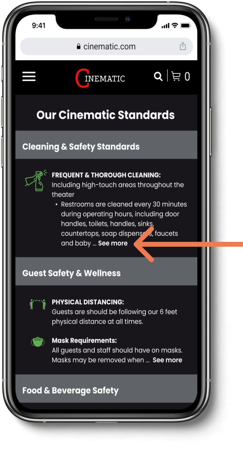
On the Cinematic standards page you can learn information on:
The cleaning and safety standards.
Guests and safety wellness.
Food and beverage safety.

After the second round of usability studies, I used these findings to iterate on my design to meet the user’s needs. Also based on the feedback from peers + mentorship feedback I made some changes to my designs to help overall meet the user's needs. Over the span of 4 weeks, I implemented some major improvements to my website.
Final Desktop Look:
For the final look, I made the private theater section larger so it could stand out. Since this section is something I decided to add to the website to address users wanting their own private space, there would be a higher chance the user would select this section and browse the private theater section. I also made a link to the safety standards and made the section green so that it would stand out and be easy to find.

Prototype for final mockups (desktop version):

Mobile Adaptation:
I made some specific design changes when adapting to the mobile version because of the limited screen size.
Wireframes for mobile:
Here are my paper wireframes for mobile web.

From paper to digital wireframes.

Once I completed my digital wireframes I created my high-fidelity mockups.
One of the changes I made on the homepage to fit the screen:
Since all the movies that were playing in the theater could not fit on one screen, I added an arrow for the user to tap to see more movie options.

Changes I made on the Cinematic standards page:
On the Cinematic standards page, there is a lot of information to read through. To save users time I added see more so that if they want to read more of the section they could. You can find see more options on popular apps such as Instagram, TikTok, and Youtube.
Prototype for final mockups (mobile web version):
Final mobile web flow:

What I learned?
Working on this project I hit so many bumpy roads however I also learned so much. Through the many stages of iterations on my designs, I was constantly reminded of the importance of putting the users first. Even though Cinematic is a personal project I feel it addresses the needs of a real problem with going to the movies. It addresses the theater safety measures, and it allows users that’s not as comfortable being around other people an option to have their own space. Creating a responsive website was very interesting and in the end it all came together and I met my goal of addressing the user’s needs.
Moving forward I would like to take everything I learned from this project, grow from it, and apply it to all my future projects. There’s definitely still room for more research and testing on this project. I can reach out to more people and get their feedback on what they would like to see in the theaters. I will continue to iterate on my designs to best meet the user’s needs.